Homes Shaped With Experience

Year
2026
Client
RHEO
Timeframe
6 weeks
RHEO set out to be a real estate brand that didn't look like every other developer chasing the same glass tower renders and stock skyline shots. With operations launching across India, the Middle East, and Europe including Stockholm and Oslo, the brand needed a visual language rooted in global design knowledge but shaped by real culture and craft rather than one generic luxury look stretched across every market.
RHEO set out to be a real estate brand that didn't look like every other developer chasing the same glass tower renders and stock skyline shots. With operations launching across India, the Middle East, and Europe including Stockholm and Oslo, the brand needed a visual language rooted in global design knowledge but shaped by real culture and craft rather than one generic luxury look stretched across every market.
The Obstacle
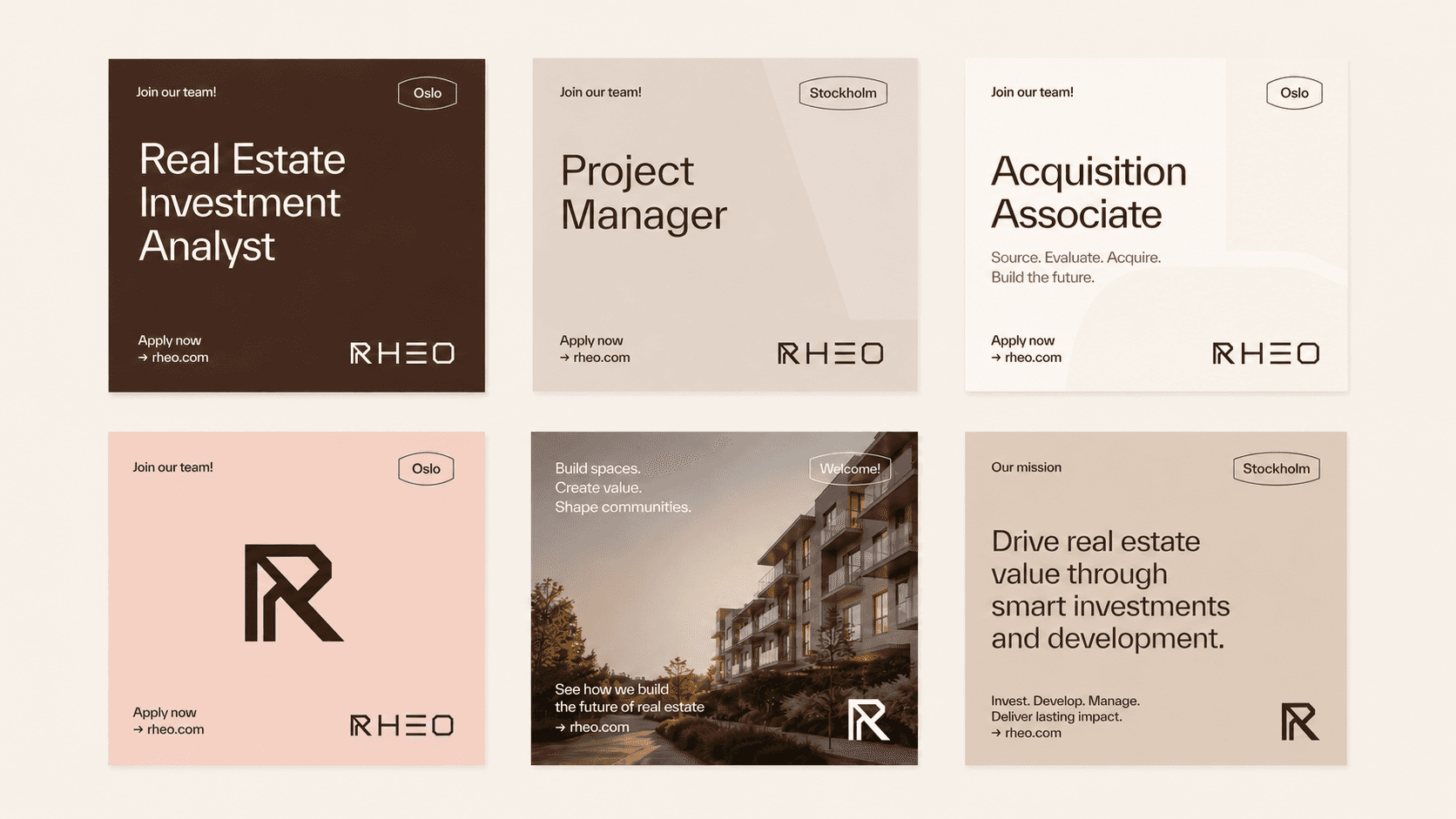
We built the identity around structure and proportion instead of ornament. The wordmark reads like architecture, angular letterforms with a mark built into the R that doubles as a compass and a rooftop line. The palette moves between deep espresso, warm terracotta, and soft ivory, grounded tones closer to stone and wood than a typical property brochure. Golden ratio circles run quietly through the brochure and signage work as a nod to proportion and permanence.
We built the identity around structure and proportion instead of ornament. The wordmark reads like architecture, angular letterforms with a mark built into the R that doubles as a compass and a rooftop line. The palette moves between deep espresso, warm terracotta, and soft ivory, grounded tones closer to stone and wood than a typical property brochure. Golden ratio circles run quietly through the brochure and signage work as a nod to proportion and permanence.
The Outcome
The brand foundation brought RHEO's vision to life across every touchpoint it needed to launch with credibility, from recruitment ads and a printed brand book to storefront signage and property brochures across its full footprint. What started as a name and an ambition now reads as a real estate brand with an actual point of view, built to hold up next to established players rather than imitate them.
The brand foundation brought RHEO's vision to life across every touchpoint it needed to launch with credibility, from recruitment ads and a printed brand book to storefront signage and property brochures across its full footprint. What started as a name and an ambition now reads as a real estate brand with an actual point of view, built to hold up next to established players rather than imitate them.


Discover other projects
Dive into our diverse collection of innovative projects, where creativity meets cutting-edge technology to solve real-world challenges

Menu
Menu
Menu